InsideTracker
Redesigning the Action Plan
Redesigning a core engagement feature to increase adoption, clarity, and personalization in a data-driven health platform.
Platforms
iOS, Android
Timeline
2024 (2 months)
Teams
Design | Product | Engineering | CX | Science | QA
My role
Led end-to-end design for the Action Plan redesign across mobile, working in a cross-functional team of product managers, engineers, QA, and designers.
Owned product thinking, UX strategy, and execution from research → delivery
Facilitated alignment across product, engineering, and program stakeholders
Balanced user needs, business goals, and technical constraints
Defined a “high-impact, low-effort” strategy due to limited engineering resources
Mentored 2 designers and drove design critiques and iteration cycles
Impact
8/10
Satisfaction score
+10%
New user engagement
+15%
Returning user engagment
About
InsideTracker is a personalized health & wellness platform that provides health insights based on blood, physiological, and genetic data.
The Action Plan is the core experience where users receive and manage these recommendations—turning complex health data into actionable steps.
Despite its importance, engagement with the Action Plan was low, making it a critical opportunity for improvement.
Current Action Plan experience
The existing Action Plan presented recommendations through a rigid, goal-locked structure. Users had limited visibility into what was available, little control over what appeared in their plan, and no easy way to navigate or filter recommendations. The feature was also difficult to discover for new users.
Grounding the problem with user data
Only 68%
Only 68%
of new users engaged with the Action Plan
Only 35%
Only 35%
of returning users
re-engaged
5.5/10
5.5/10
Satisfaction rate from Action Plan
This pointed to a gap between the value of the recommendations and how users experienced them.
User Research
I conducted 10 moderated user interviews to understand friction points and uncover behavioral patterns.
The research focused on:
Discoverability of the Action Plan
Understanding and trust in recommendations
Interaction with recommendations (add/remove/edit)
Perceived personalization and relevance
Where the experience breaks down
Low perceived relevance: An inconsistent volume of recommendations: either too few or too many without prioritization- made the experience feel generic and hard to act on, leading to disengagement.
Confusing goal logic: Users didn’t understand why recommendations changed based on goals
Rigid structure: the fixed 90-day plan felt restrictive and static.
Lack of personalization: Users felt recommendations were generic and not tailored.
“I don’t feel like I’m getting anything unique.”
Strategic Approach
Given engineering constraints, I defined a high-impact, low-effort strategy focused on improving engagement without requiring a full system redesign.
Rather than rebuilding the recommendation engine, I focused on how recommendations are surfaced, structured, and interacted with- unlocking existing value through better UX.
Ideation
Through collaborative workshops with product and design, we explored multiple directions and prioritized solutions based on impact vs. effort.
Key principles we aligned on:
Expose more value → “Show the full menu” of recommendations
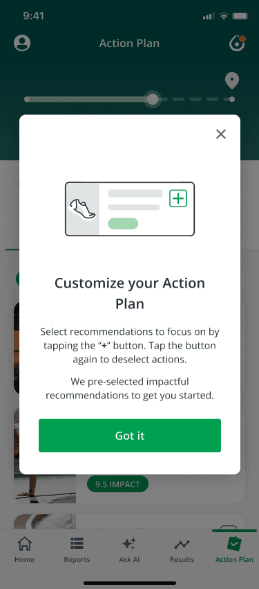
Increase flexibility → Let users choose and adapt their plan
Reduce friction → Remove unnecessary setup steps
Improve navigation & visibility

Design & iterations
I explored multiple layout and interaction models, iterating based on team feedback and constraints.
Key design explorations:
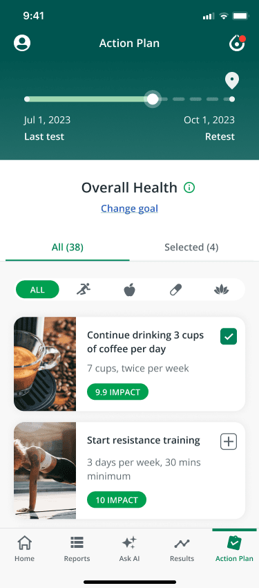
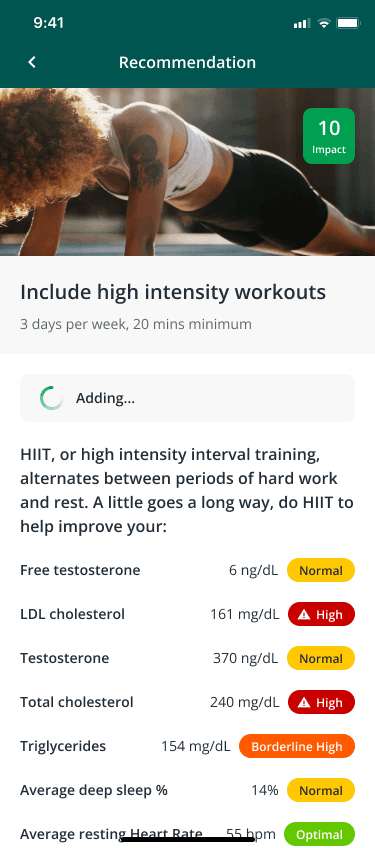
Transition from large cards → compact, scannable recommendation cards
Introduced add/remove (check-in) interactions directly on cards
Reworked page hierarchy to increase content density and clarity
Added filtering and sorting for better control
Designed a default Action Plan to eliminate onboarding friction
Each iteration balanced usability improvements with engineering feasibility.


Usability testing
I conducted a moderated usability study with 13 users using a clickable prototype.
Key tasks tested:
First-time onboarding & discoverability
Adding/removing recommendations
Editing goals
Understanding recommendations
Results:
All users successfully completed core tasks
Satisfaction improved from 6/10 → 8/10
Users reported better clarity, control, and perceived personalization

Solution
The redesign put control in users' hands.
Users can now browse the full set of personalized recommendations and build their own plan freely. Smaller cards, filtering, and sorting make navigation effortless. For new users, the Action Plan is created automatically: eliminating the setup drop-off entirely.
Key screens from new experience
Key screens from new experience


Project outcome
The redesign successfully improved both engagement and user satisfaction, validating the “low-hanging fruit” strategy.
Strong lift in both new and returning user engagement
Significant improvement in perceived usability and clarity
Increased interaction with recommendations
The work also created a foundation for future improvements.
8/10
Increase in satisfaction score- Up from 5.5/10
+10%
New user engagement 68% → 78%
+15%
Returning user engagement
35% → 50%
8/10
Increase in satisfaction score- Up from 5.5/10
+10%
New user engagement 68% → 78%
+15%
Returning user engagement
35% → 50%
About
InsideTracker is a personalized health & wellness platform that provides health insights based on blood, physiological, and genetic data.
The Action Plan is the core experience where users receive and manage these recommendations—turning complex health data into actionable steps.
Despite its importance, engagement with the Action Plan was low, making it a critical opportunity for improvement.
Current experience
The existing Action Plan presented recommendations through a rigid, goal-locked structure. Users had limited visibility into what was available, little control over what appeared in their plan, and no easy way to navigate or filter recommendations. The feature was also difficult to discover for new users.
Key screens
Project outcome
The redesign successfully improved both engagement and user satisfaction, validating the “low-hanging fruit” strategy.
Strong lift in both new and returning user engagement
Significant improvement in perceived usability and clarity
Increased interaction with recommendations
The work also created a foundation for future improvements.
Grounding the problem with user data
Only 68%
of new users engaged with the Action Plan
Only 35%
of returning users re-engaged
5.5/10
Satisfaction rate from Action Plan
Impact
8/10
Satisfaction
+10%
New user engagement
+15%
Returning user engagment
My role
Led end-to-end design for the Action Plan redesign across mobile, working in a cross-functional team of product managers, engineers, QA, and designers.
Owned product thinking, UX strategy, and execution from research → delivery
Facilitated alignment across product, engineering, and program stakeholders
Balanced user needs, business goals, and technical constraints
Defined a “high-impact, low-effort” strategy due to limited engineering resources
Mentored 2 designers and drove design critiques and iteration cycles
Platforms
iOS, Android
Timeline
2024 (2 months)
Teams
Design | Product | Engineering | CX | Science | QA
Ideation
Through collaborative workshops with product and design, we explored multiple directions and prioritized solutions based on impact vs. effort.
Key principles we aligned on:
Expose more value → “Show the full menu” of recommendations
Increase flexibility → Let users choose and adapt their plan
Reduce friction → Remove unnecessary setup steps
Improve navigation & visibility
Strategic Approach
Given engineering constraints, I defined a high-impact, low-effort strategy focused on improving engagement without requiring a full system redesign.
Rather than rebuilding the recommendation engine, I focused on how recommendations are surfaced, structured, and interacted with- unlocking existing value through better UX.
Research insights
Low perceived relevance: An inconsistent volume of recommendations: either too few or too many without prioritization- made the experience feel generic and hard to act on, leading to disengagement.
Confusing goal logic: Users didn’t understand why recommendations changed based on goals
Rigid structure: the fixed 90-day plan felt restrictive and static.
Lack of personalization: Users felt recommendations were generic and not tailored.
“I don’t feel like I’m getting anything unique.”
Solution
The redesign put control in users' hands.
Users can now browse the full set of personalized recommendations and build their own plan freely. Smaller cards, filtering, and sorting make navigation effortless. For new users, the Action Plan is created automatically: eliminating the setup drop-off entirely.
Crafted with creativity, late-night iterations, Ctrl+Z reflexes, and a carefully curated playlist.
© Chen Segal 2025
Crafted with creativity, late-night iterations, Ctrl+Z reflexes, and a carefully curated playlist.
© Chen Segal 2025
© Chen Segal 2025